The UX of AI: Designing a Calming and Trustworthy Voice-First Health Interface
How we moved beyond a cold, robotic kiosk to create an empathetic AI health companion that users trust
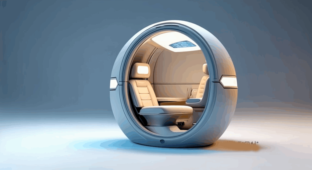
The White Coat Syndrome for Machines
Healthcare is intimidating. Walking into a sterile clinic can spike blood pressure and induce anxiety—a phenomenon known as “white coat syndrome.” When we set out to build AuraPod, we realized we weren’t just building a diagnostic device; we were designing an experience that had to overcome deep-seated fears and build trust in minutes
A flashy touchscreen with complex menus wouldn’t cut it. We needed an interface that was calming, guiding, and empathetic. The solution was a voice-first, AI-powered conversational interface that makes users feel like they’re being cared for, not processed by a machine
This article breaks down the UX principles and technical architecture that make this possible.
Our Foundational UX Principles
- Reduce Cognitive Load: The user shouldn’t have to figure anything out. The pod should guide them effortlessly through each step.
- Build Trust Through Transparency: The AI must explain what it’s doing and why at every stage. No black boxes.
- Prioritize Accessibility: The interface must work equally well for someone in a wheelchair, someone with visual impairment, or someone who isn’t tech-savvy.
- De-medicalize the Experience: Avoid clinical terminology and cold, sterile aesthetics. Use warm colors, soft lighting, and calm sounds.
The Architecture of an Empathetic AI
Building this requires more than just a good voice artist. It requires a multi-layered AI system that understands not just words, but context and intent.

Technical Deep Dive: The Adaptive Dialog System
The core of our UX is a state machine managed by the Rasa framework. It doesn’t just follow a rigid script; it adapts based on real-time user feedback.
Example: The Blood Test Negotiation
One of the biggest points of anxiety is the finger-prick blood test. Our system is designed to guide users through it with empathy and flexibility.
python

# Pseudocode for the adaptive blood test dialog flow
def handle_blood_test_intent(user_intent, user_emotion_score):
    """Decides how to guide the user through the optional blood test."""

    if user_emotion_score > 0.8:  # User is highly anxious
        response = "I understand this can be a bit worrying. It's just a tiny prick and over in a second. Would you like to see how it works first?"
        show_video_demonstration()
        await_user_response()

    elif user_intent == "DECLINE_BLOOD_TEST":  # User says "I'd rather not"
        response = "That's perfectly okay. It's optional. We can skip it for now and you can still get a full report from the other tests. Shall we continue?"
        log_skip_decision()

    else:  # User is confident or neutral
        response = "Okay, great. The next step is a quick finger prick for the blood test. Please place your finger on the yellow circle."
        activate_lancet_mechanism()

    # Speak the response using Amazon Polly's empathetic voice
    speak(response, voice='Joanna', style='empathetic')
Key Technical Components:
- Emotion Recognition: We use a lightweight model that analyzes vocal tone (prosody, pitch, speed) and, if visual consent is given, micro-expressions to assign a simple “anxiety score” that informs the dialog policy.
- Contextual Awareness: The system knows if you’ve just had a stressful test (like a blood draw) and might follow up with a more calming tone for the next step.
- Multimodal Reinforcement: Instructions are given via voice and simultaneously reinforced on screen with a simple animation. For example, when the voice says “Please take a deep breath,” the screen shows a simple animation of a circle expanding and contracting.
Designing the Sound of Trust
The voice itself is a critical product decision. We conducted A/B tests with hundreds of users on Amazon Mechanical Turk to select the right voice profile.
The Winning Formula:
- Voice: Amazon Polly’s “Joanna” (Neural)
- Pace: Slower than average (about 85% of normal speed)
- Pitch: Medium, with a slight downward inflection at the end of sentences to sound calm and assured, not questioning.
- Phrasing: Uses “we” and “us” to create a collaborative feel (“Let’s check your blood pressure next.”). Avoids imperative commands (“Take your blood pressure.”).
Sound Design:
- Audio Icons: We designed unique, soft musical tones for success (a rising pentatonic chime) and for errors (a gentle, descending “plunk”).
- Background Ambiance: A very subtle, low-volume ambient soundscape is played to mask external noise and create a calming bubble. Users can turn it off.
The Results: Measuring Trust and Calm
We didn’t just guess at what felt good; we measured it. During our pilot studies, we tracked:
- Physiological Signs: We saw a 15% lower average heart rate during the session compared to the user’s baseline before entering the pod, indicating reduced anxiety.
- Session Completion Rate: 99% of users who started the assessment completed it, compared to high abandonment rates on complex touchscreen kiosks.
- User Feedback (NPS): We consistently received a Net Promoter Score (NPS) of +80 or higher, with qualitative feedback highlighting how “easy,” “calming,” and “not like a machine” the experience felt.
- Accessibility: Users with visual impairments or mobility issues reported the voice-guided interface was significantly easier to use than traditional touch-based kiosks.
Lessons Learned
- Empathy is a Feature, Not an Afterthought: It must be designed and engineered into the core architecture of the product.
- Voice > Touch for Guidance: For a sequential, guided process, a conversational interface is far more intuitive than a complex touchscreen menu.
- Transparency Builds Trust: When the AI explains its actions (“I’m adjusting the arm rest for you”), it demystifies the process and makes the machine feel more like a partner.
- Test with Anxious Users: If your design works for someone who is highly anxious about the process, it will work for everyone.
Conclusion
The most advanced AI in the world is useless if people are too intimidated or confused to use it. By focusing on the UX of AI—prioritizing empathy, transparency, and accessibility—we were able to transform a daunting diagnostic procedure into a surprisingly calm and empowering experience.
The technology becomes invisible, and what the user remembers is not the machine, but the feeling of being cared for. And that is the ultimate metric of success.
What about the regulatory hurdles for an AI-based medical device? The final article in this series provides a practical checklist for navigating the FDA. Follow me to stay updated.
Let’s connect on LinkedIn to discuss AI, UX, and the future of human-computer interaction.